To create a unique name and fully curated brand identity that stands out in the real estate and design market while exuding professionalism across multiple service offerings.
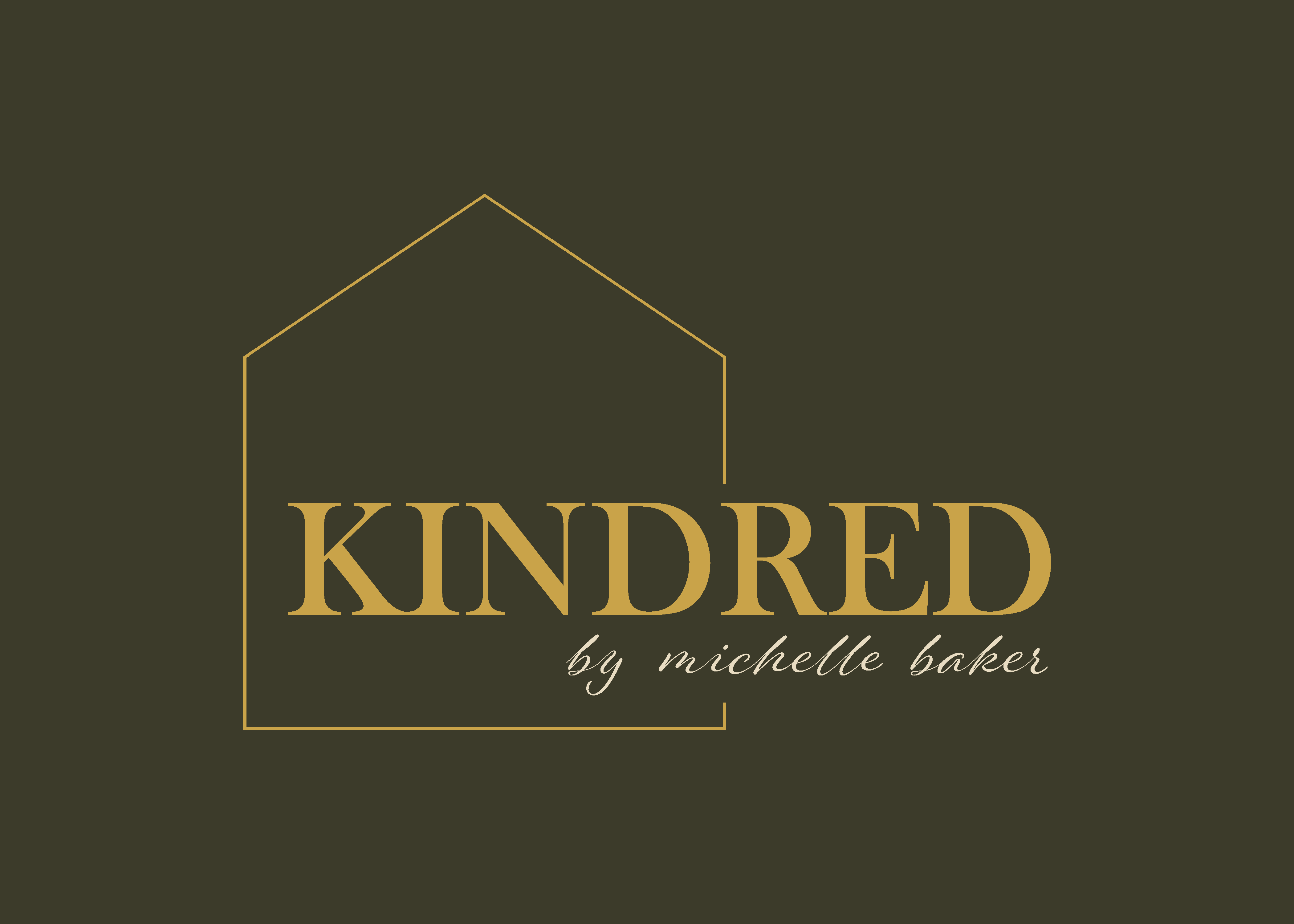
This project began at the foundation level. Michelle was ready to move beyond operating solely under her personal name and build something that could grow beyond her as an individual. We started with naming, exploring options that felt elevated, timeless, and reflective of her relationship centered approach to design and staging. The name Kindred emerged as a natural fit, evoking connection, alignment, and a sense of shared vision between Michelle and her clients.
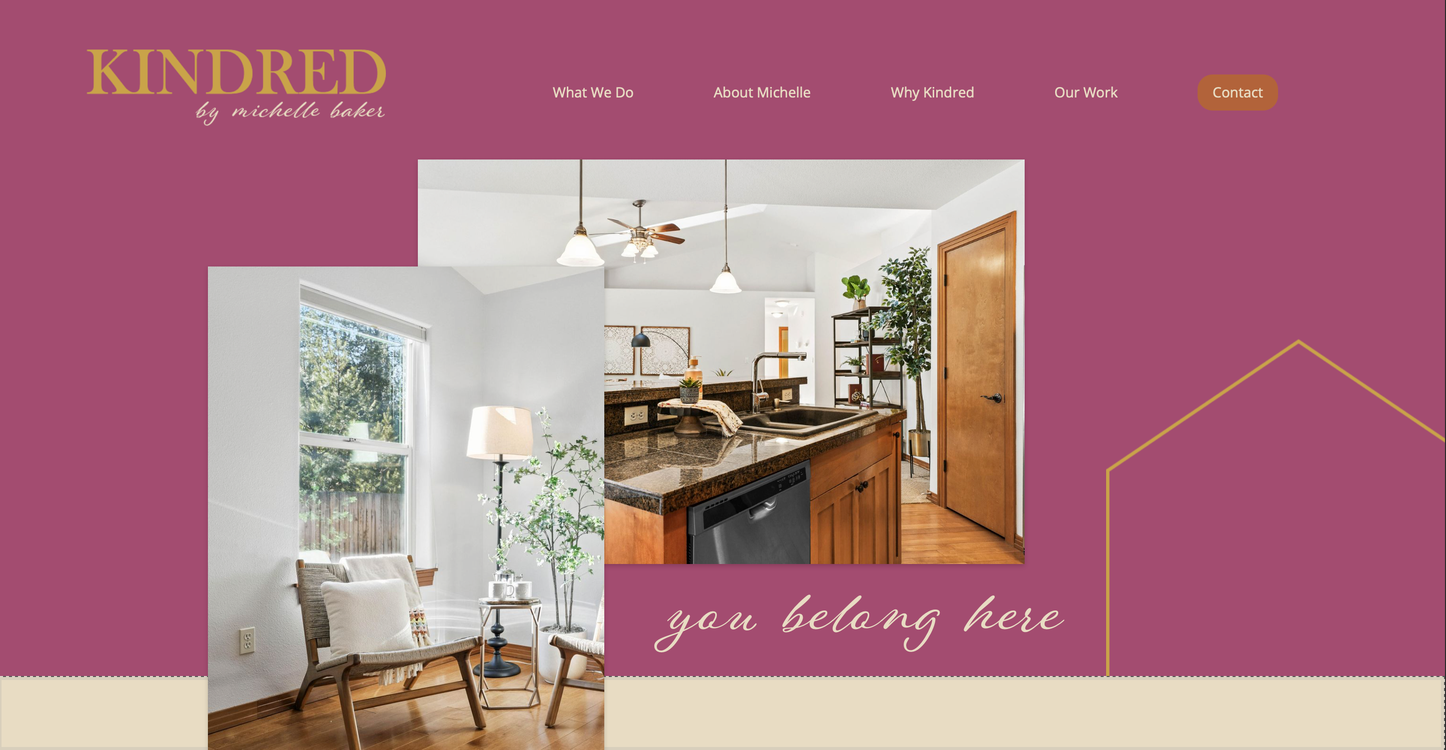
With the name established, we moved into full brand curation. The challenge was to create an identity that balanced sophistication with approachability. The brand needed to feel polished enough for luxury real estate listings while still inviting and warm for homeowners seeking design support. Typography selections leaned refined and confident, while layout systems were designed to feel structured and intentional.
Color played a significant role in shaping the personality of the brand. The inclusion of magenta introduced a bold yet tasteful energy that immediately distinguishes Kindred from more muted competitors in the market. When paired with a grounded supporting palette, the result feels modern, confident, and welcoming all at once. The magenta acts as a signature accent that draws the eye and creates memorability without overwhelming the overall aesthetic.
The final outcome is a cohesive brand built entirely from scratch, from name to visual identity system. Michelle now operates under Kindred Design and Staging with a professional presence that reflects her expertise and positions her for long term growth. The brand was created with scalability in mind, giving her the foundation to expand her practice and eventually transition or sell the business when the time is right. More than a logo and color palette, Kindred is a strategic identity that captures Michelle’s character and sets her up for the next chapter of her career.